Exclusive Branding and Logo Design of FERS by Grapheine
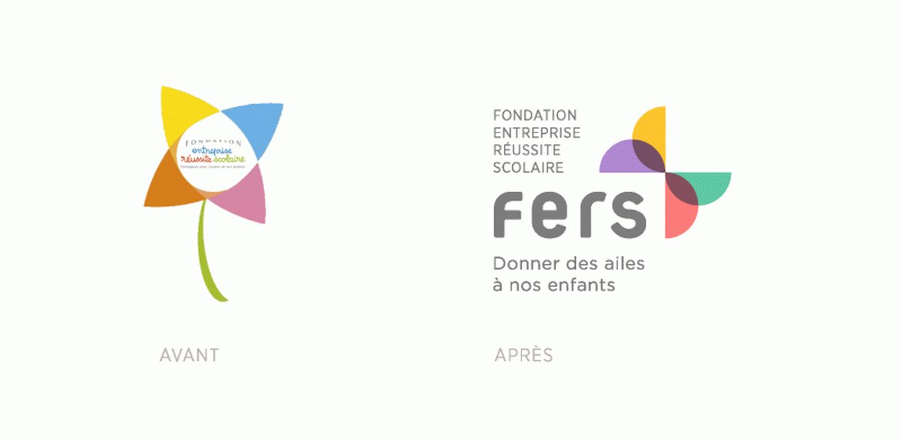
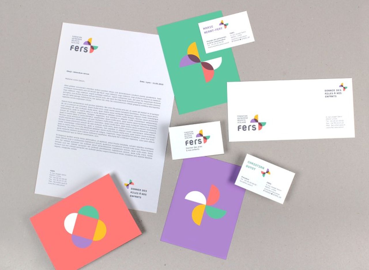
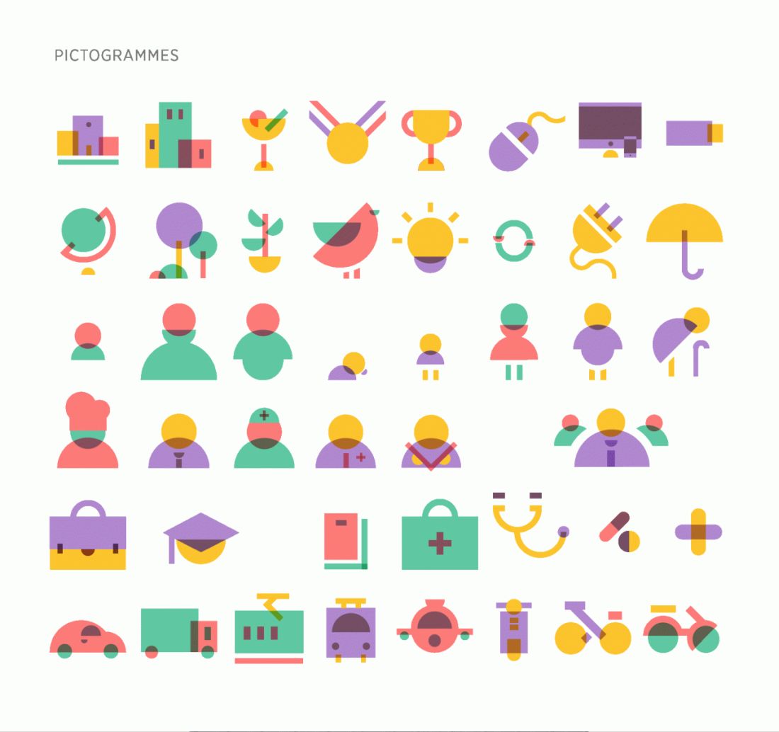
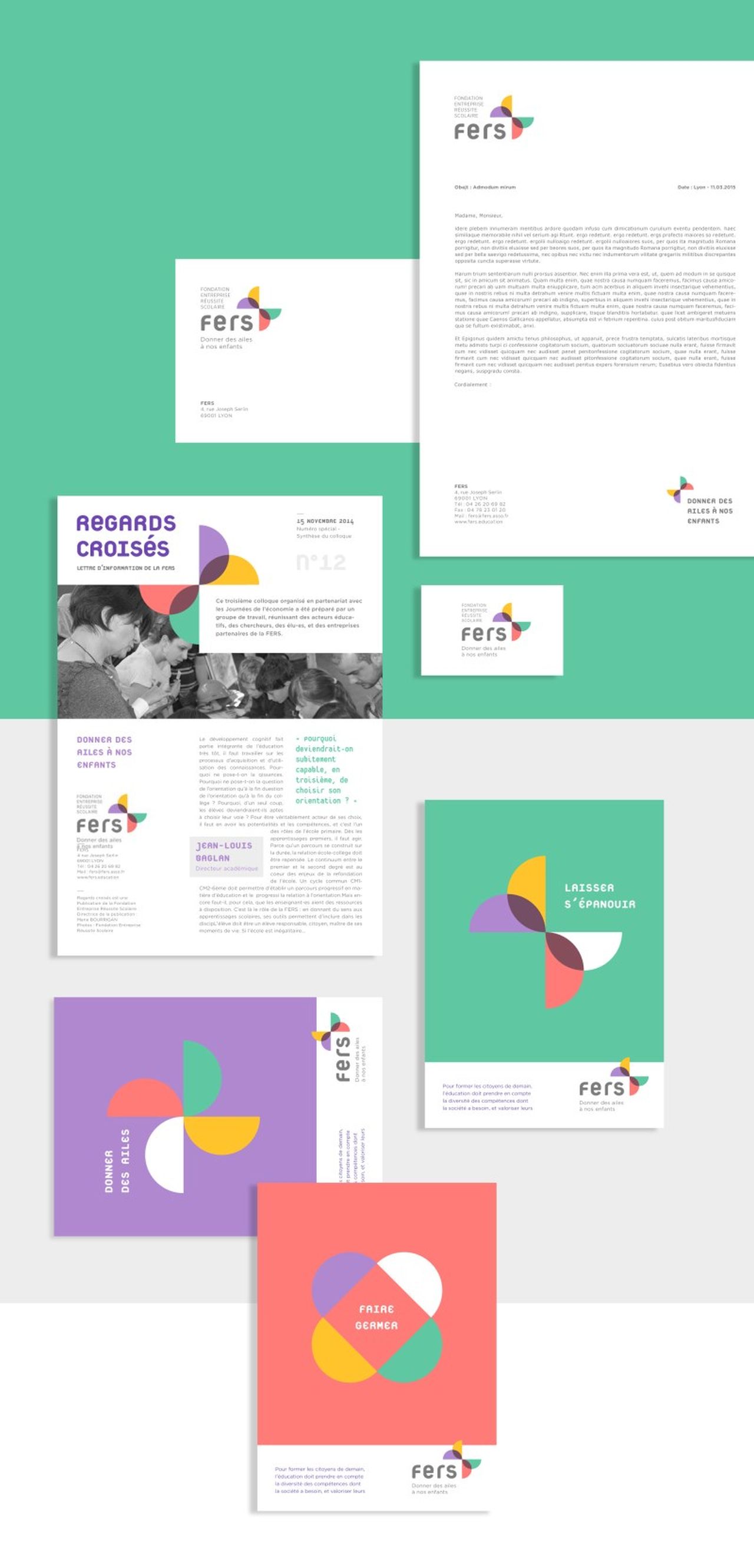
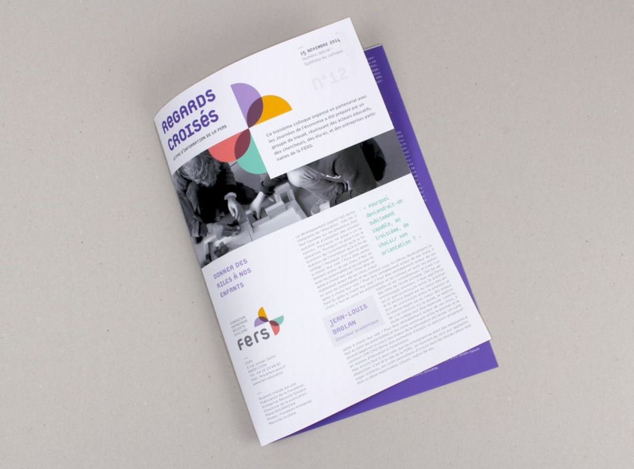
FERS, the foundation company for school success in France had a facelift of its logo with the help of French design agency Grapheine. The motive behind the creation of FERS is to enhance the knowledge of children in the economic, cultural and technical fields of the contemporary world. The old logo flower symbolises the blooming of the children and hence it has to be retained but in an innovative way. Grapheine made the continuation of the flower by blowing it up to become a butterfly, so the little flowers would reach their heights with their wings crossing all hindrances. The mission of the foundation to let children flourish comes to life with these tiny wings. FERS created in 1990 by the city of Lyon and several companies is a public utility that forms the skills and clears the paths of the children, by the changes coming up in the technological world the foundation needed to improve the legibility of its name which led to the new logo. Let us scroll down to explore the exclusive branding and design identity process of FERS by Grapheine.
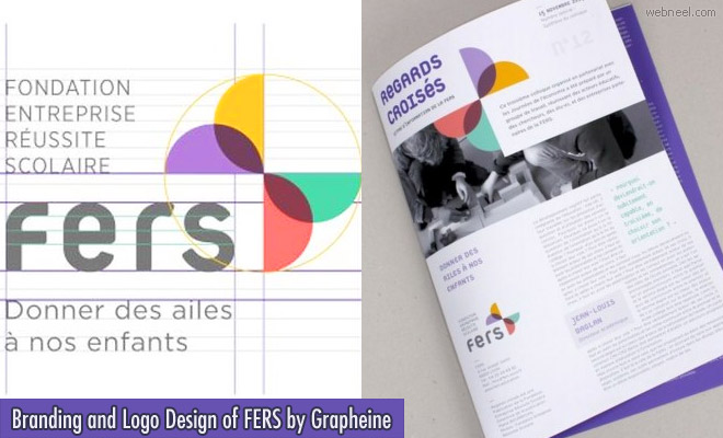
Branding and logo design of fers by grapheine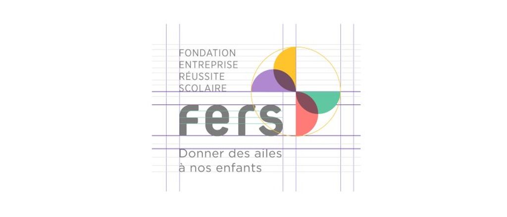

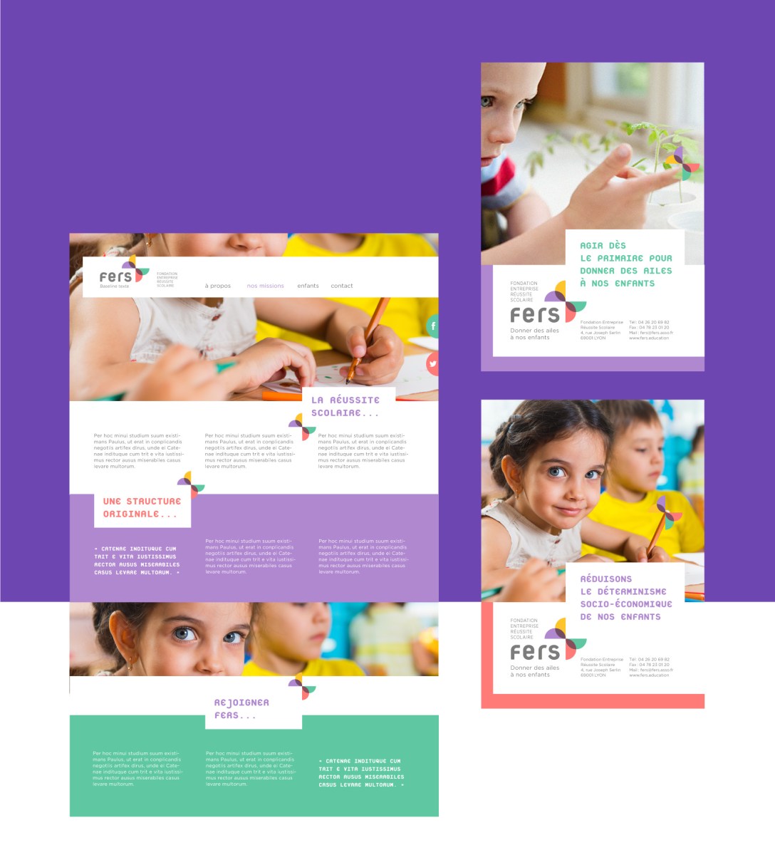
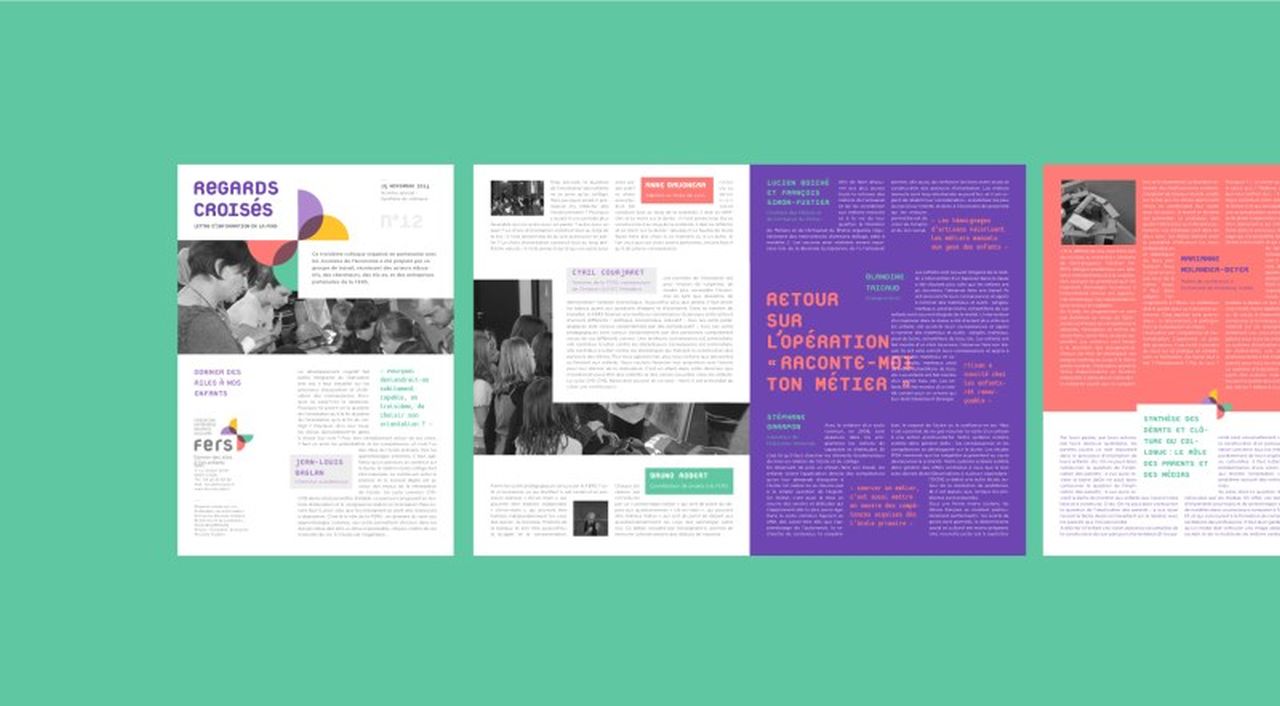
To know more Visit: Website
Related Posts
25 Beautiful Branding and Identity Design ideas for your inspiration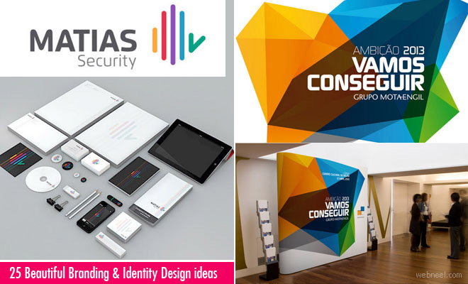
Olympics 2024 creative branding logo identity ideas by Grapheine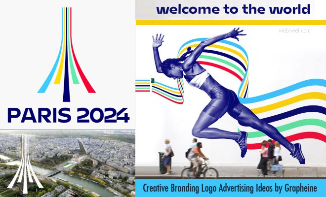
50 Creative Branding and Identity Design examples for your inspiration
See All Branding Designs | Types of logo designs | Graphic Design Websites | Logo Design Contest | Logo Design Ideas | Creative Logo Designs | Custom Logo Design Services
Tag : Branding, Branding Identity Design, Logo Design